The Product
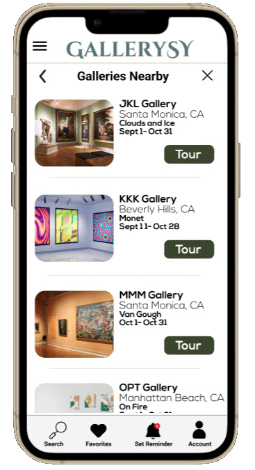
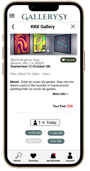
Provide an app that allows users to see a list of current gallery tours available on a chosen day. They can easily check-in for a tour, view the list of artists on the exhibition, get a check-in alert, and show a scan code to quickly enter the gallery for the tour. The target audience will be anyone wanting to visit an art gallery, such as artists, journalists, children, the elderly, students, or lecturers.
My Role
UX designer designing Gallerysy app from conception to delivery.
Responsibilities
Conducting interviews, paper and digital wireframing, low and high-fidelity prototyping, conducting usability studies, accounting for accessibility, and iterating on designs.
User research
summary
I conducted interviews and created empathy maps to understand the users I’m designing for and their needs. A primary user group identified through research was adults who like going to art galleries but don’t like waiting in long lines to check-in for a tour.
This user group confirmed initial assumptions about art gallery attendees, but research also revealed that waiting in long lines was not the only problem affecting art gallery attendees. Other user problems were not attendees not receiving a reminder of when the art gallery tour will begin, group size of the tour, and information about the art and artists.
Key Insights
-

Gallery tour attendees are driving from far away and waiting in long lines to check-in for a gallery tour.
-

Gallery tour attendees are not receiving a reminder to check-in for a gallery art tour
-

Gallery tour attendees should be able to present a scan code to quickly enter gallery without having to wait in long lines.
-

Gallery tour attendees are not receiving a reminder to check-in for a gallery art tour
Persona
I write stories about our human existence, and art provokes my imagination. It helps me develop more descriptive writing.
Paper wireframes
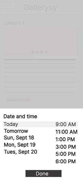
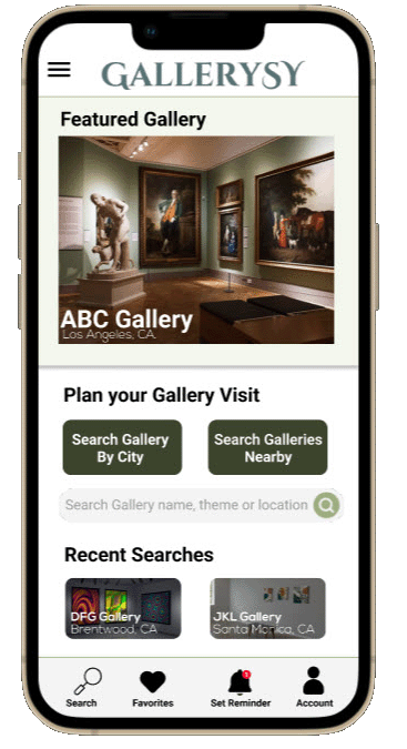
Taking the time to draft iterations of each screen of the app on paper ensured that the elements that made it to digital wireframes would be well-suited to address user pain points. For the home screen, I prioritized a quick and easy way to search for gallery exhibits and check-in for an art gallery tour to help tour attendees save time.
Usability study
findings
I conducted two rounds of usability studies. Findings from the first study helped guide the designs from wireframes to mockups. The second study used a high-fidelity prototype and revealed what aspects of the mockups needed refining.
-

⚫Users want searching for a gallery to be more obvious ⚫Users want other options besides adding to Apple wallet ⚫Users want length and size of tour to be included in tour confirmation
-

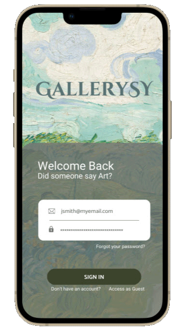
⚫Users want an option to login before they access the rest of the ⚫Users want to also click on the image of the gallery to confirm tour ⚫Users want tour times that are not available greyed out
Final Mockups
“It was so easy to book a gallery tour. I would use this app all the time!”
Takeaways
Impact
The app made users feel that the Gallerysy app values their time.
What I learned
While designing the Gallerysy app, I learned that all the different parts of the design process are essential for creating a great app, especially conducting usability studies and getting peer reviews. It helps you understand how users will use the app in the real world.
Next Steps
Conduct another round of usability studies to validate whether the pain points users experienced have been effectively addressed.
Conduct more user research to determine any new areas of need.


