The Product
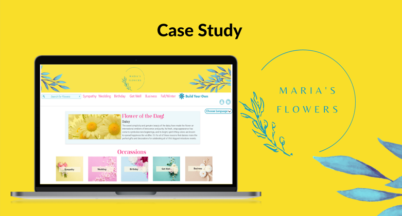
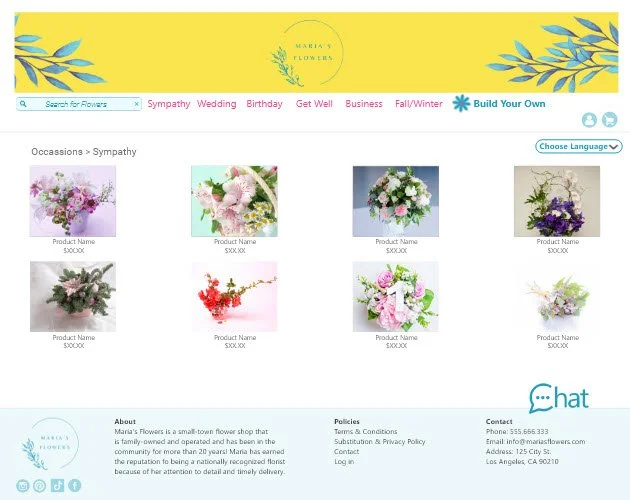
Maria's Flowers is a local floral shop that sells flower arrangements, including custom floral arrangements designed by the customer. Most users will be professionals or older adults. The typical user will be 20-80 years old.
My Role
UX designer leading the Maria's Flower website design.
Responsibilities
Conduct interviews, paper and digital wireframing, low and high-fidelity prototyping, conduct usability studies, account for accessibility, iterating on designs and responsive designs.
User research
summary
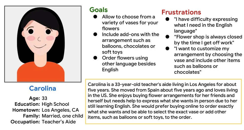
I conducted user interviews, which I then turned into empathy maps to understand the target user and their needs better. I discovered that many target users like buying from their local florist but can only make it after work when the flower shop is already closed. Also, they like the option to customize the flower arrangement and include other items like soft toys or chocolates with their order
Key Insights
-

Local floral shops are closed after work hours which can make buying flowers difficult for working adults
-

Language barrier exists when trying to buy flowers in person.
-
Want the ability to create custom flower arrangements and not only choose among already made arrangements
Persona
Flowers always bring a smile to my face
Sitemap
Not being able to customize flower arrangements was one of the pain points for the users, so I acknowledged that in the sitemap. My goal is to make it possible for users to buy already-made flower arrangements that include add-ons while also being able to create their custom arrangements by selecting the colors, flowers, vases, and add-ons. The customer can also change the site to the language of their choice.
Paper wireframes
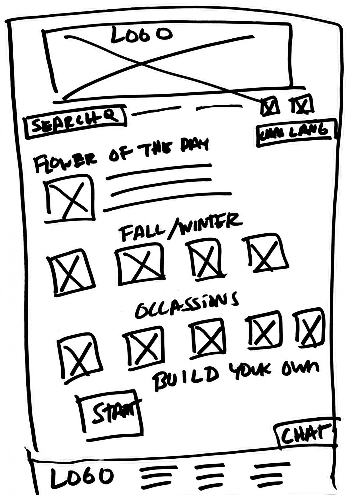
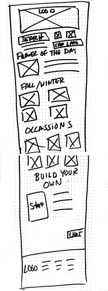
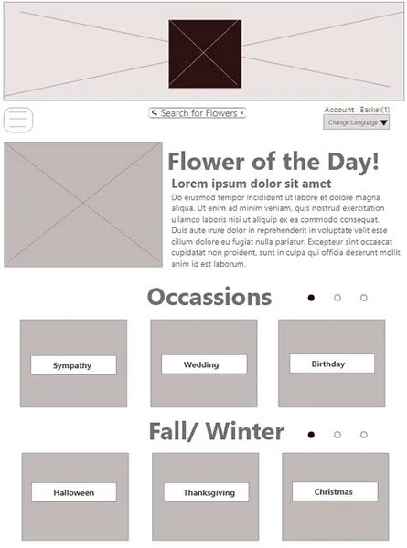
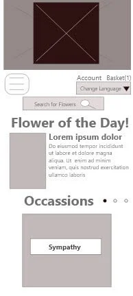
Next, I sketched out paper wireframes for each screen on my website, keeping the user pain points about language, customization, and showing available arrangements arranged by season and occasion.
The home screen paper wireframes variations focus on optimizing the browsing experience for the users.
Digital Wireframes
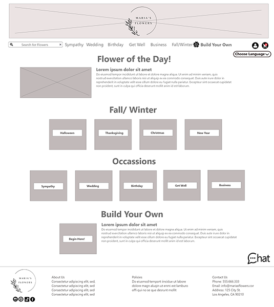
Moving from paper to digital wireframes made it easy to understand how the redesign could help address user pain points and improve the user experience.
Prioritizing the option to change language and making it easy for the user to customize their flower arrangement.
Usability Study
Main Findings
-

"Build Your Own” should be more visible and obvious in the homepage
-

Logo on top of page should be clickable to return to the homepage
-

"Build Your Own” page should have choices appear once prior option is chosen, instead of showing all choices all at once
Final Mockups
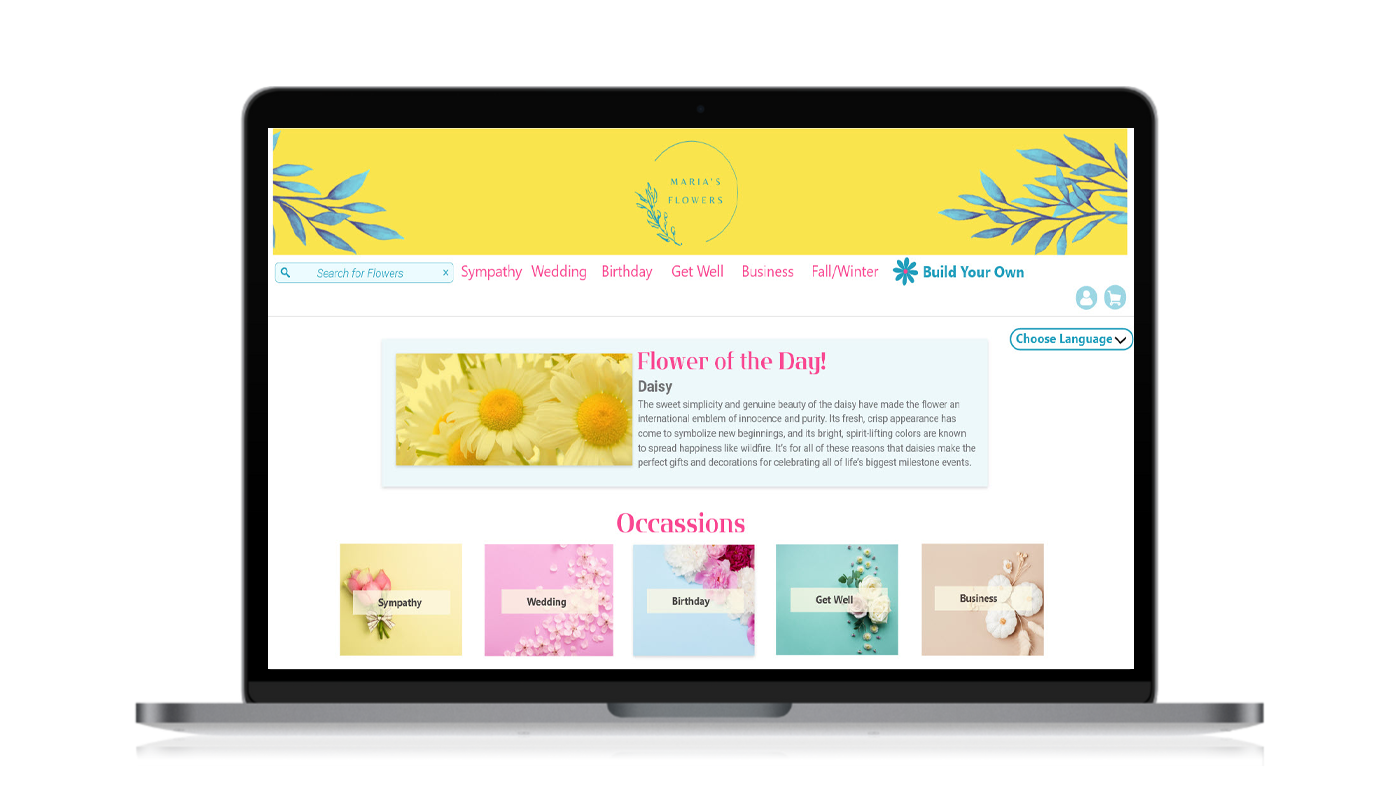
Because users shop from various devices, it was essential to optimize the browsing experience for a range of devices, such as mobile and tablet. Thus, users have the smoothest experience possible. I included considerations for additional screen sizes in my mockups based on my earlier wireframes.
Usability study
findings
I conducted two rounds of usability studies. Findings from the first study helped guide the designs from wireframes to mockups. The second study used a high-fidelity prototype and revealed what aspects of the mockups needed refining.
“The customization feature was great! I would love to be able to order flowers like this!”
Takeaways
Impact
Our target users shared that the design had engaging visuals to help them navigate the site. The typography, colors and card design made viewing the information and the site accessible.
What I learned
I learned that many factors create a well-design website that is engaging and accessible. The critical takeaway is continuously focusing on the user's needs to facilitate the best possible user experience.
Next Steps
Conduct follow-up usability testing on the new website.
Identify additional areas of need and ideate on new features.

